California, New York and Illinois continued to hemorrhage taxpayer returns in 2023--the latest year for which data is available. All three have been the biggest losers since 2012. On the plus side, Florida, Texas and North Carolina welcomed the most new taxpayers to their states. You can check out Data-Z.org to see how much adjusted gross income per taxpayer and how many taxpayers and exemptions have left your state.
The IRS publishes year-to-year address changes as reported on individual income tax returns. Migration patterns are available for the inflow (the number of new tax filers who moved to a state) and outflow (the number of tax filers leaving a state). The IRS Migration of Tax Returns given here is the net loss or gain in the number of returns for a state and is derived by calculating the difference between inflows and outflows for the year.
According to the IRS, "Migration data for the United States are based on year-to-year address changes reported on individual income tax returns filed with the IRS. They present migration patterns by State or by county for the entire United States and are available for inflows—the number of new residents who moved to a State or county and where they migrated from, and outflows—the number of residents leaving a State or county and where they went." SOI Tax Stats - Migration Data
The IRS Migration of Tax Returns, Ranking of the states from 1 to 50 for tax return migrations shows how the states compare concerning the net migration of income tax returns. States with the lower numbers refer to states with higher net in-migration compared to those with higher numbers. Thus, Florida, which ranks 1, indicates that the largest number of people migrated and filed new tax returns there, versus New York, which ranks 50, meaning that it has the lowest amount of migration and new tax returns.
For more information about methodology, see the IRS Migration Data Users Guide. READ MORE
Which states have the largest and the least payload of debt at the end of the year?
On Data-Z.org you can find the state rankings of debt per capita, the total amount of debt, and that amount indexed to 2005. Of course, interest has to be paid on the debt, which you can also find on Data-Z.org. Check out your state and compare it to other states.
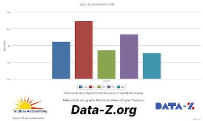
The chart above represents the number of days between a city's fiscal year-end and the date it publishes its Annual Comprehensive Financial Report for the five largest U.S. cities. Timely financial information is critical for city decision-making, including budgeting. The Government Finance Officers Association recommends that cities issue annual reports within 180 days of year-end, but Truth in Accounting advocates issuing them within 100 days. For comparison, most corporations report within 45 days. While cities face internal challenges, faster reporting ensures citizens and legislators have the information needed to make informed decisions on budgets, policies, and voting.
According to the 2025 National Movers Study | United Van Lines®, the five states where the most moving vans were headed outbound, rather than inbound, were New Jersey, New York, California, North Dakota and Colorado. Seventeen states had over 50% outbound shipments. Of the five states that had the greatest percentage of shipments leaving the state, one stands out. As late as 2020, Colorado had always had fewer than 50 percent outbound shipments. Since 2021, however, they have seen a steady rise in outbound shipments compared to inbound shipments.
According to United Van Lines, "U.S. movers are moving primarily for the opportunity to be closer to family (29%), company transfer/new job (26%) and retirement (14%)" and a "broad migration shift toward smaller cities and towns is redefining American relocation patterns." READ MORE
In 2025, according to the U.S. Census the five states that lost the most population per 1000 were Vermont, Hawaii, West Virginia, New Mexico and California. The states that increased the most in popoulation were Utah, Texas North and South Carolina, and Idaho, with all showing double digit gains.
Our 2025 Financial State of the States report paints a stark picture of fiscal irresponsibility across the U.S., with unfunded pension liabilities emerging as one of the most pressing threats to long-term state solvency.
These liabilities represent promised retirement benefits to public employees—such as teachers, firefighters, and state workers—that governments have committed to but failed to adequately fund. By shortchanging pension contributions today, states are effectively borrowing from the future, shifting massive costs onto tomorrow's taxpayers. This practice not only undermines balanced budgets but also erodes public trust in government accounting. Drawing from the most recent audited financial reports (primarily fiscal year 2024, with some states using 2023 data due to delays), we reveal a collective national shortfall that underscores the urgency for reform. READ MORE
Chicago's unfunded pension benefits continue to rise way above the national average for the top U.S. cities, growing from $20 billion in 2014 to over $37 billion in 2023. Funding of pensions and OPEB has been a financial and poltical problem for years in Chicago, with no end in sight. READ MORE
Across all 50 states from 2019 to 2023, the average percentage change in intergovernmental revenue per capita (the most efficient way to compare states) was a striking 58 percent! The percentage change ranged from 30.6 percent in Idaho to 114 percent in Oklahoma. Since the lion’s share of intergovernmental revenue to states comes from the federal government, and most of the increase since 2019 was Covid aid, the question is how will states make up the difference when the Covid grant monies run out. Presumably, the states will have to raise taxes or cut services significantly. States have become used to that extra revenue. Will they be prepared for what comes next?
Personal income per capita in the United States grew on average $12,816 or 23.9 percent since 2019, which certainly sounds like a big jump. However, in that same time period personal consumption per capita also rose significantly; on average between 2019 and 2023 (the most recent data available) personal consumption spending went up 25.9 percent. These figures are not adjusted for inflation, but they show that spending increased more than personal income.
The chart below illustrates three different measures of the federal deficit. You choose: Which number do you like best?